


[ad_1]
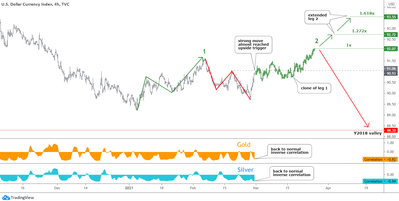
The U.S. dollar index (DXY) chart opens this update.
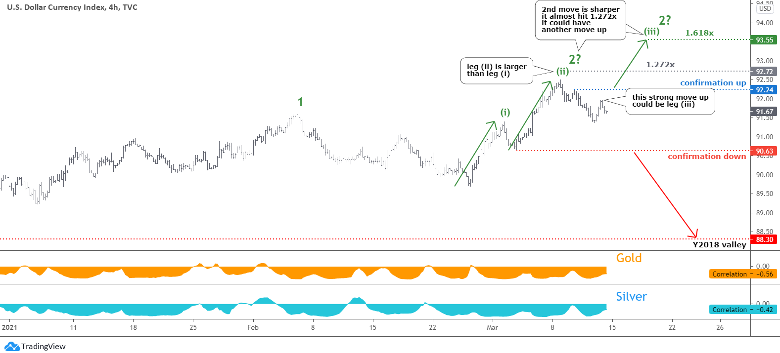
The plan posted at the beginning of this month played out amazingly accurate in the DXY chart. The dollar, indeed, moved to the upside hitting beyond the first target of 92.07, and it almost reached the second goal with a 1.272x multiplier at 92.72 mark. The maximum of 92.50 was established on March 8. This move has a sharper angle, and it reached the target earlier than the clone of the first move up.
This time I put more annotations to highlight all crucial things for education. The main question is whether the second move-up is over or not. We can see two distinct minor legs in the current move to the upside marked as (i) and (ii); the latter is larger than the former. Then the price reversed to the downside within a zigzag. This could be another minor consolidation ahead of the leg (iii) to the upside.
I put two markers on the chart to be watched for confirmations. The blue one at 92.24 will trigger the continuation to the upside. The target with a 1.618x ratio was set before at 93.55. The red trigger at 90.63 would confirm the reversal down. The minimum of Y2018 should be retested to complete the structure then.
The precious metals are losing correlation, but the normal negative link with the dollar is still there, and gold has a higher negative reading than silver.
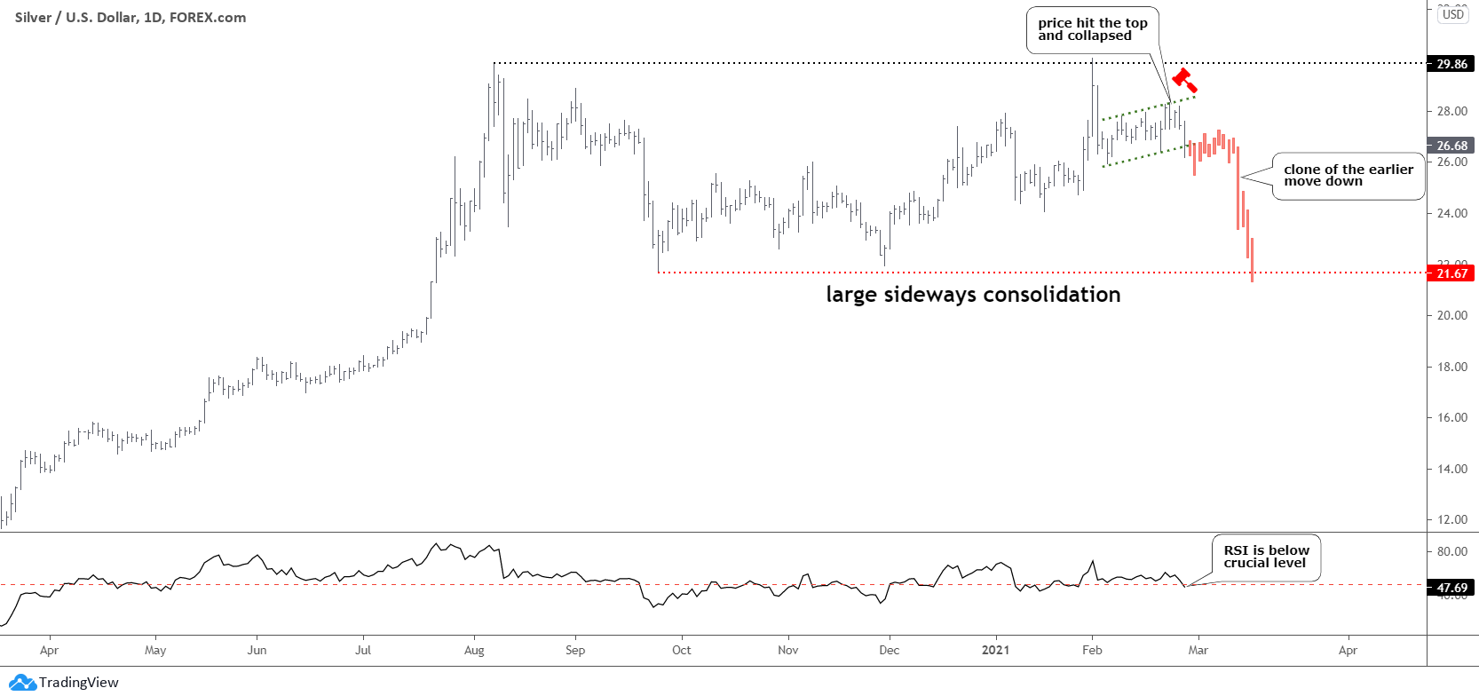
The silver chart follows as I changed the regular order because gold requires more explanations this time.
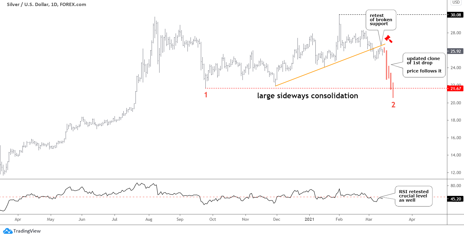
The structure in the silver chart looks like a no-brainer as I just updated the clone of the first drop according to the structure that emerged. The price of silver follows the updated plan as posted last time.
The price broke below the orange trendline support on March 4. Currently, we can see how it retests that broken support. The red clone implies a further sharp drop that could emerge soon. Then the gradual descent should follow to tag the former valley of $21.67 or even breaks lower. The whole structure would be completed then.
The RSI confirms the current pullback as it retested the crucial 50 level recently.
In the last poll, the downside scenario gathered more support from you, and the Bullish path doesn’t look dominating.
The Gold chart is the next.
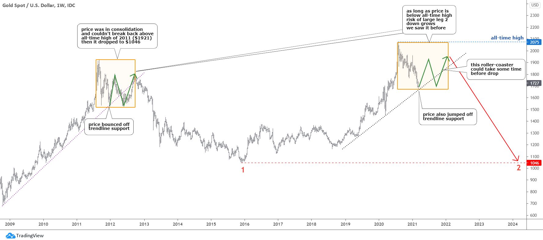
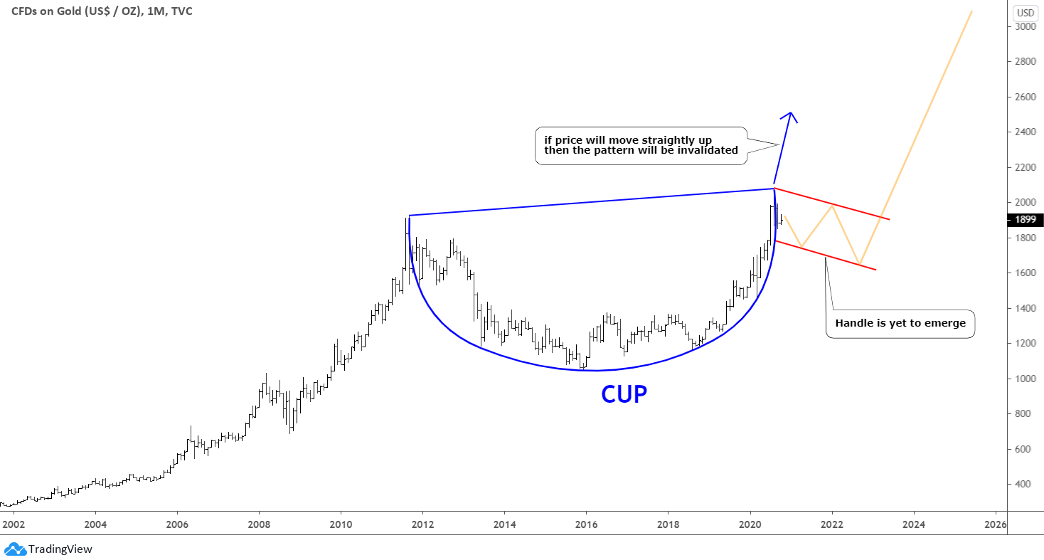
It is not a regular update as gold has already met all the required criteria of the completed structure.
When I switched between different periods, my eyes spotted a similar-looking pattern on the monthly chart of gold. I highlighted it with the orange box on the left in the chart above. It is actually a wake-up call as the consequences of the found pattern could be disastrous for the top metal.
It is not the main path yet, but the time is ticking for the price to overcome the all-time high beyond $2075. Otherwise, this scenario would start to play out. We saw it before in the left orange box in 2011-2012. The price had made many zigzags then, but the price growth momentum was not enough to break higher, so the gold price collapsed to the valley of $1046, losing almost half of its price from the peak. The history may repeat to build a second leg down within a giant sideways consolidation. It could tag the former low of $1046 established in 2015.
There is another visible similarity between the two compared periods. Both times the price bounced off the trendline support (dotted) initially. Then the green zigzag to the upside followed ahead of the large collapse. The former could be a screaming roller coaster for investors, and it can take some time to emerge.
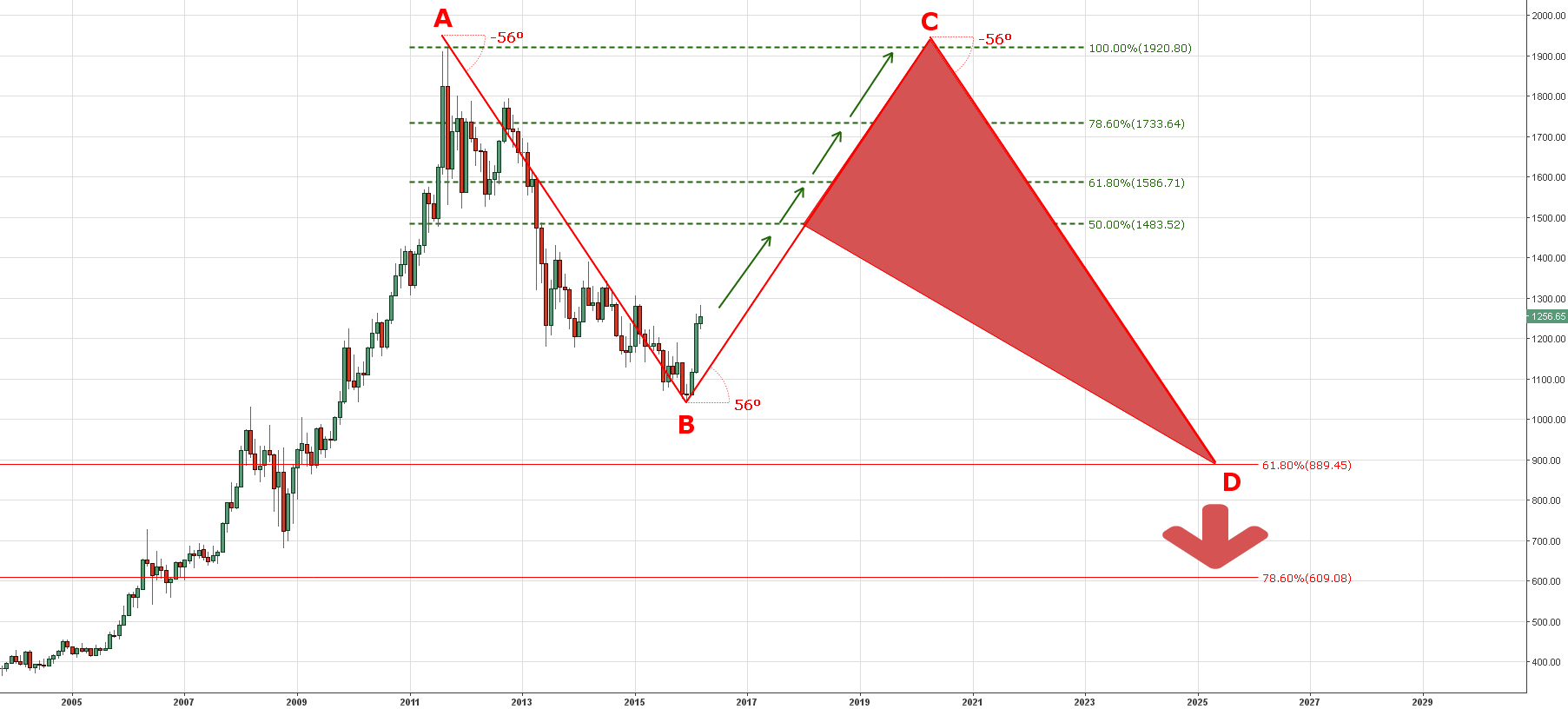
I shared this scenario with you precisely five years ago in March of 2016 in the chart below. At that time, it was too distant future to think about the possible new leg down marked as a red CD segment in the chart beneath. The C point exceeded the A mark, and the possible large sideways consolidation will be slanted upward.

What could push the gold price down so hard? The possible answer is in the chart below.
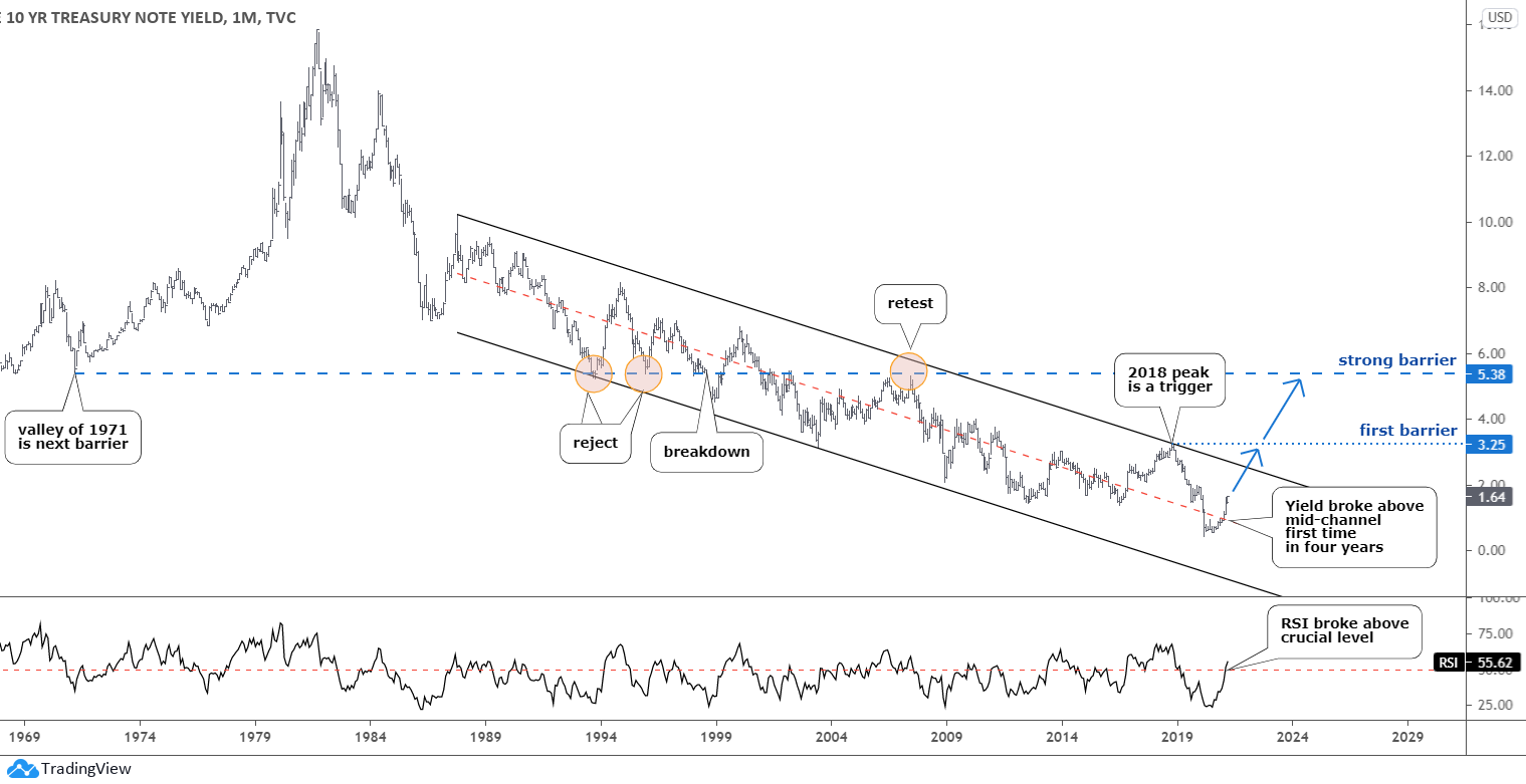
The recent rally of benchmark 10-year Treasury yield (10Y) pushed the precious metals price lower. The yield growth means the sell-off of the Treasury notes, which act as a safe haven as gold does. It is a sign of optimism about economic growth and a warning of inflation fears after the approval of the $1.9 trillion stimulus package.
The 10Y is trapped within a long-lasting black downtrend channel, which started in distant 1987. The yield reversed a year ago after establishing a record low of 0.4%. It did not touch the downside of the channel as the trend could be fading already. Moreover, the 10Y broke above the red mid-channel recently, and this move was confirmed with the breakup on the RSI sub-chart.
The first real barrier sits on the top of 2018 at 3.25%. There is also a trendline resistance in the 2.6% area ahead of it. The strong resistance is located much higher at the 5.38% mark where the valley of the distant 1971 was established. It was die-hard support in 1993 and 1995 as it rejected the drop then. It was broken down only at the end of 2000 and then retested in 2007. I think it will not be on our radar in the near future.
We should keep in mind three possible scenarios now. The first one is the retest of the all-time high of $2075. The second one is the Cup & Handle pattern posted last October. The last one but not the least, is the large sideways consolidation shown in this post above.
Intelligent trades!
Aibek Burabayev
INO.com Contributor, Metals
Disclosure: This contributor has no positions in any stocks mentioned in this article. This article is the opinion of the contributor themselves. The above is a matter of opinion provided for general information purposes only and is not intended as investment advice. This contributor is not receiving compensation (other than from INO.com) for their opinion.
[ad_2]


